Brand
An identity rooted in the West, built for the next decade.
Calm, modern, and technically precise. Our brand reflects how we work — with clarity, craft, and quiet confidence. The public guide stays curated; the internal guide holds the full asset library.
The mark
Wordmark
The Jonsen LLC wordmark is the primary signature of the brand. Use it generously, with quiet confidence and ample breathing room.
Color
Palette
A grounded palette of alpine green, golden-hour warmth, and bright canvas. Designed for clarity in light, restraint in dark.
Alpine Green
#2F5C3E
Primary — leadership, calm authority
Golden Hour
#D4A24C
Warm accent — momentum, optimism
Canvas
#F8F7F2
Background — open space, clarity
Graphite Ink
#1F2A24
Foreground — typography, structure
Stone
#E5E2D8
Borders, dividers, surfaces
Sage Mist
#D9DFCF
Secondary surfaces, callouts
Typography
Type system
Fraunces for display warmth and Inter for everyday clarity. Together they balance editorial craft with engineering precision.
Display — Fraunces
Aa
The modern firm.
Use for headlines, page titles, eyebrow callouts. Weights 400–600.
Body — Inter
Aa
Clear, readable, structural. Built for interfaces and long-form text.
Use for body, UI, captions. Weights 400–700.
Imagery
A curated public-facing image library
Public brand imagery should feel expansive, grounded, and unmistakably Western. Choose the strongest frames with honest light, clear composition, and enough range to make the brand feel durable and broad — not repetitive.
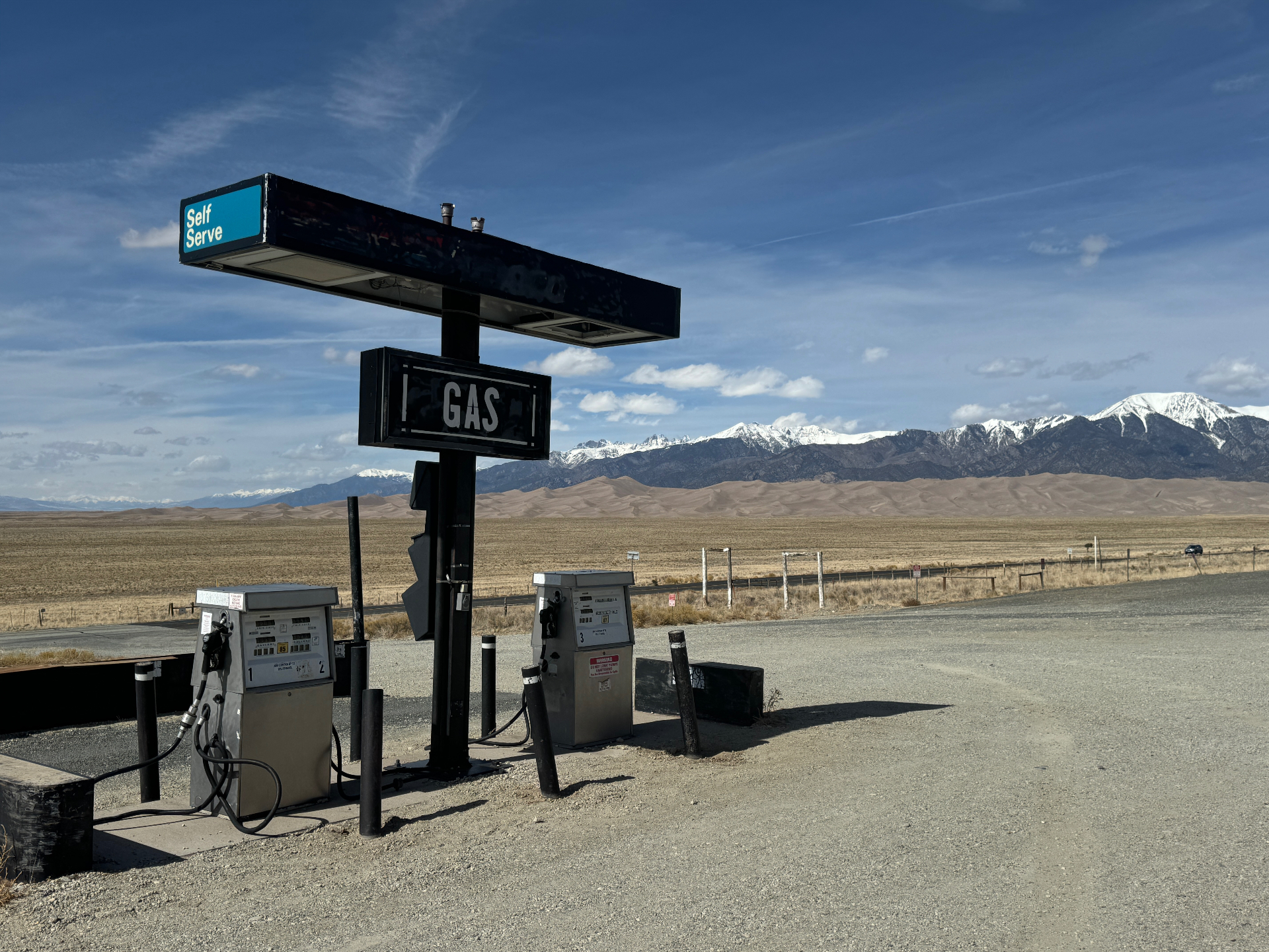

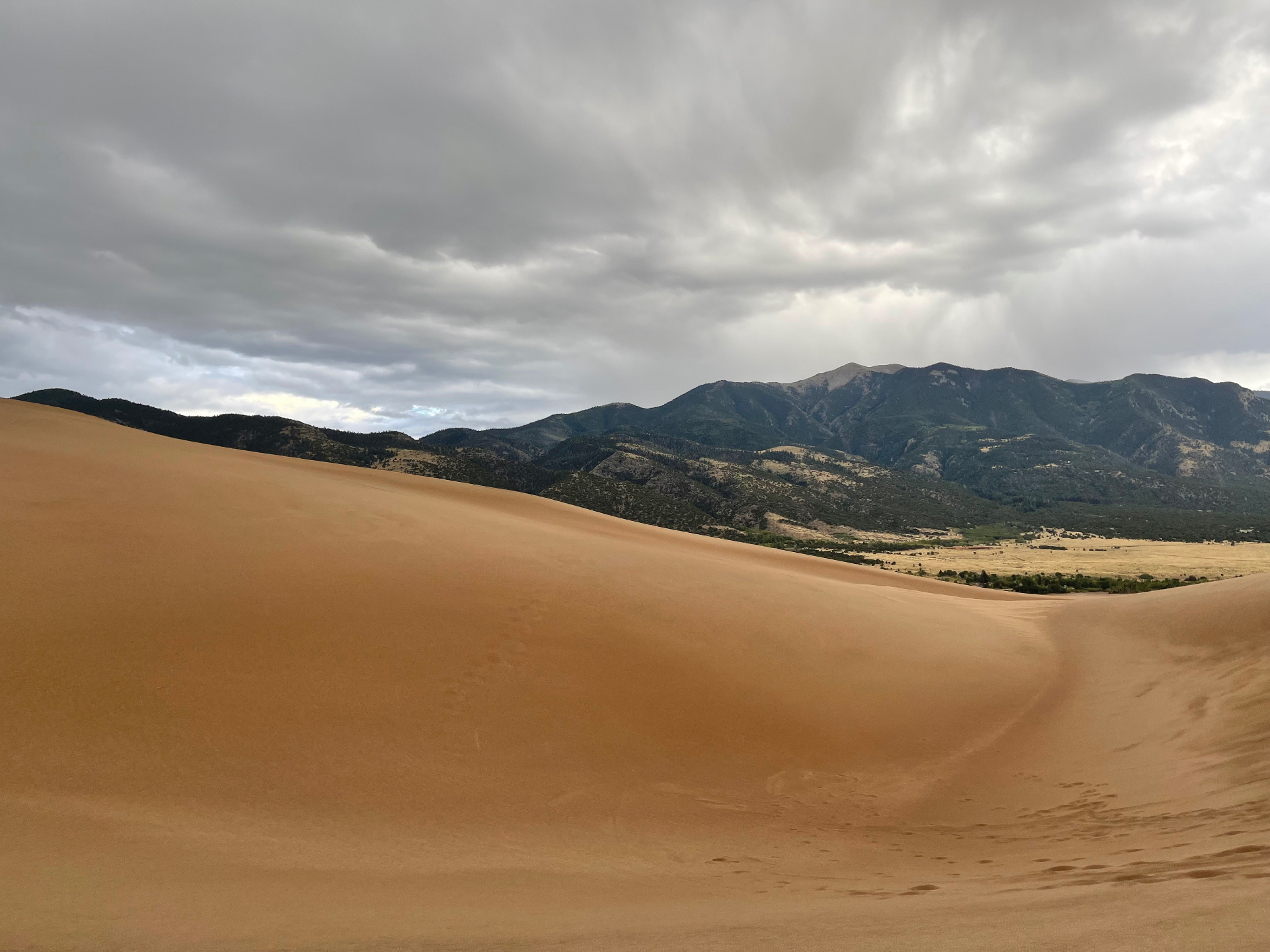
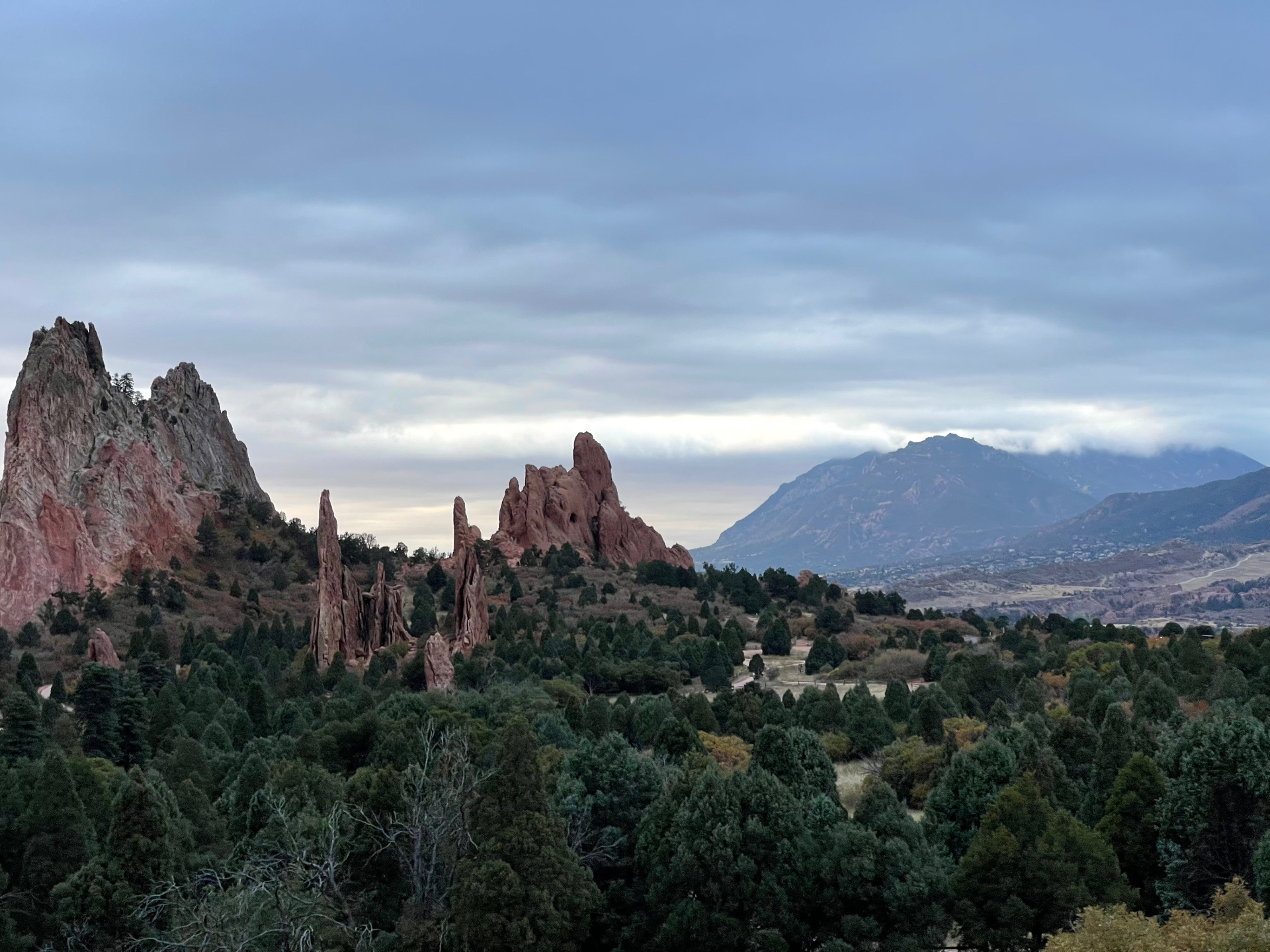
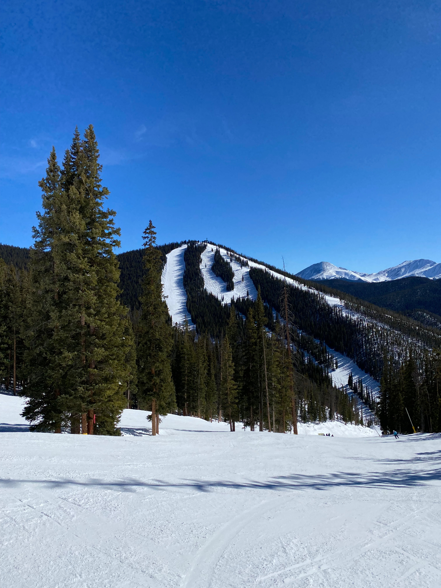


Favor wide vistas, civic landmarks, seasonal contrast, material detail, and quiet editorial moments. Avoid literal office stock, staged collaboration photos, or imagery that feels glossy before it feels true.
The full working photo archive, asset downloads, and broader internal-use imagery live in the team portal brand guide.
Voice
How we sound
Compassionate. Intuitive. Tenacious. We write the way we work — with respect for the reader's time.
Calm
Plain language over jargon. Confidence without volume.
Specific
Name the system, the outcome, the next step. Avoid abstractions.
Generous
Explain the why. Credit the team. Leave room for the reader.
Internal team
Need the full brand guide?
Logo files, curated public selects, the complete internal photo library, downloads, and usage notes live in the team portal.